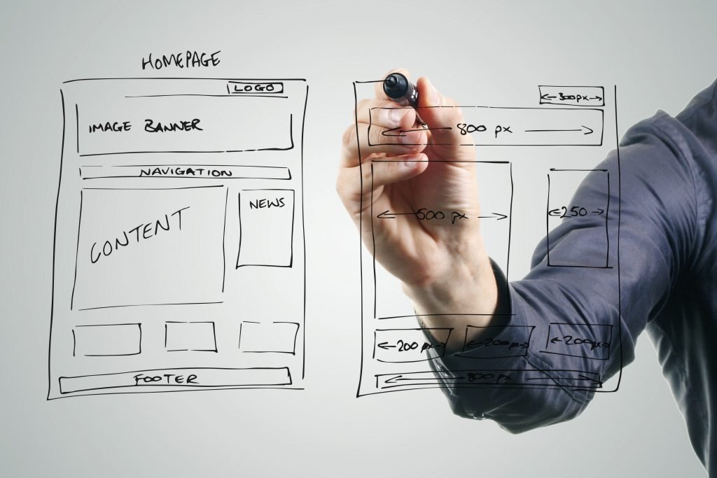
Understanding visual hierarchy is a crucial part of web design. When designing for the web, you want users to be able to quickly and easily navigate your site. By correctly organizing the elements of your website, you can lead users through the site with visual cues. Careful application and balance of fonts, colors, size, and white space can make your website intuitive and easy to use.
Fonts
Every typographic decision is important in web design because users rely on text to help them find what they are looking for. Titles and headlines should be easy to see at a glance; you can make them pop by making them larger, bolder, or adding color. Every headline you create should be set in a typeface that is easy to read and that stands out on the page.
Body copy shouldn’t be distracting or too large. By keeping it tidy and easy to read, the body sits back and doesn’t distract from navigating the larger title elements. To add hierarchy within your paragraphs, you can bold certain words and phrases and italicize others. This allows users to identify the headline for the correct paragraph and then effectively skim the paragraph to determine whether it’s actually what they’re looking for.
Finding complementary typefaces for your headlines and body can help tie the two elements together so readers quickly associate them as a single unit. Choose fonts that fit the overall graphic style of the site so navigating throughout the site is a visually pleasing experience.
Color
Color is another tool that helps users pick out important information on a page. Color headlines make it easy for readers to quickly identify where each section begins. Incorporating color in various elements throughout your website can liven up its look and reinforce brand colors.
Size
The bigger an object is, the more attention it demands on the page. Scaling images to reflect their importance allows readers to process information in the most logical order. The biggest elements should typically be the most important and the smallest the least important. In terms of visual hierarchy, a viewer’s eye will naturally be drawn to larger objects.
White Space
When a web page is overcrowded with content, it can be frustrating for the user to try to find what they’re looking for. Leaving white space spreads out your content and makes it much easier to scan and locate information on the page.
Scanning Patterns
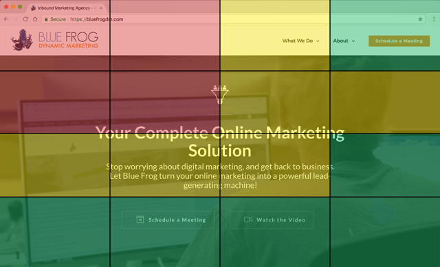
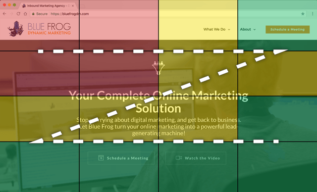
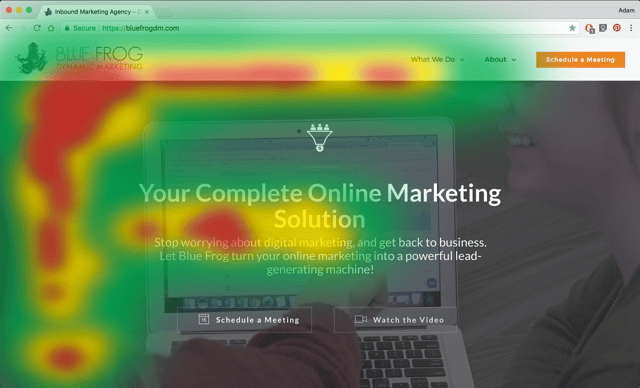
Eyetracking research has shown noticeable trends in how users approach a website and digest the information in front of them. Sites that don’t work with these patterns can hurt user experience and make navigation a challenge. A 200-website eyetracking study suggests that the red areas of the screen illustrated below get the most view time, the yellow is second, and green the least.
Z-Pattern
This scanning pattern is used on pages that are not centered on the text. Readers first scan a horizontal line across the top of a page. This of often because of the menu bar, but it is also a habit that comes from reading left to right. Once the eye reaches the end of the horizontal line, it moves down and to the left, another left to right reading habit, and starts over again. The pattern resembles the letter Z.
F-Pattern
Google is a great example of where users use an F-pattern scanning method. Readers first scan down the left side of the page from the top left, looking for keywords and page titles that jump out to them. Once they find a title that matches what they’re looking for, they read the rest normally is a horizontal line. This search pattern that resembles the letter F is ideal for scanning text heavy websites like blogs and wikis.
Visual hierarchy is a key part of web design. Understanding how to properly use it will allow you to maximize your site’s effectiveness.
If you would like us to analyze your current website to see how it can be improved, or if you would like information on building a new website for your business, contact Blue Frog Dynamic Marketing. We provide website design services in Des Moines, Denver, and across the country. Click the link below to request a consultation.